In 2020, I worked closely with Liquity’s founders to understand how they wanted to present the protocol. I translated that vision into the logo, visual identity, illustrations, and a Webflow launch site.
The site began as a one-page introduction and grew into a fuller visual explanation of interest-free borrowing against ETH collateral.
liquity.org
Logo design
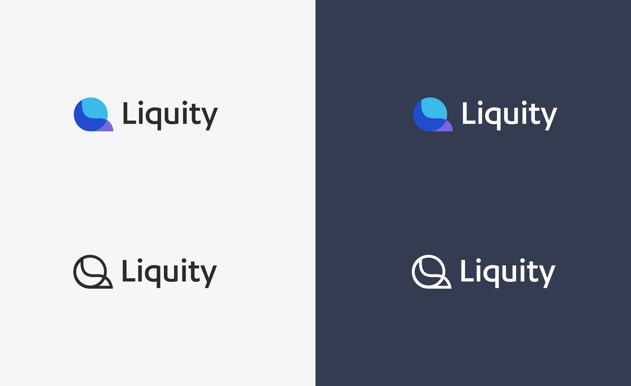
The Liquity logo combines an “L” and a coin-like “O” into a “Q”, echoing both “equity” and “liquidity”.
Building the website
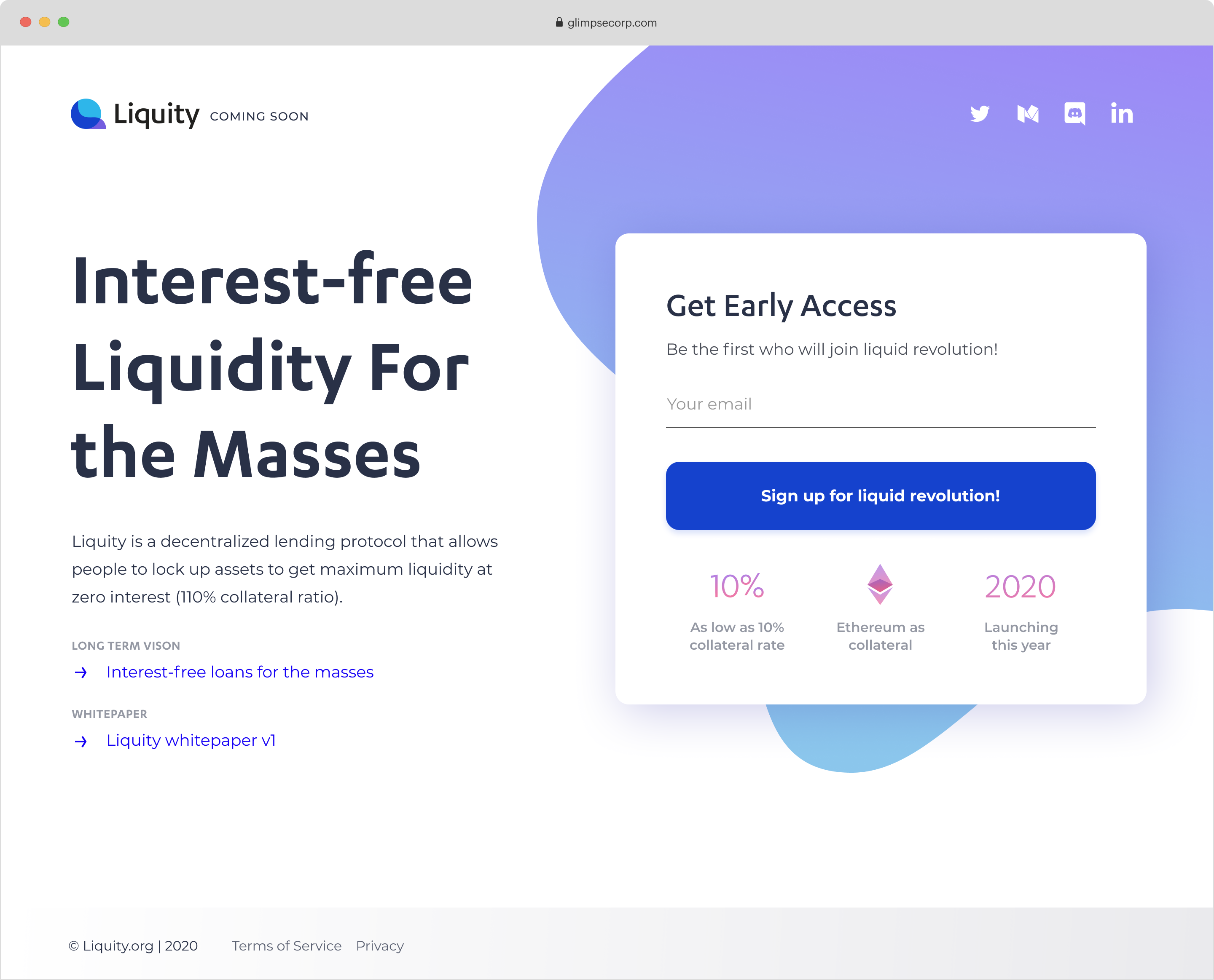
I started with a one-page Webflow site that introduced the protocol before launch.
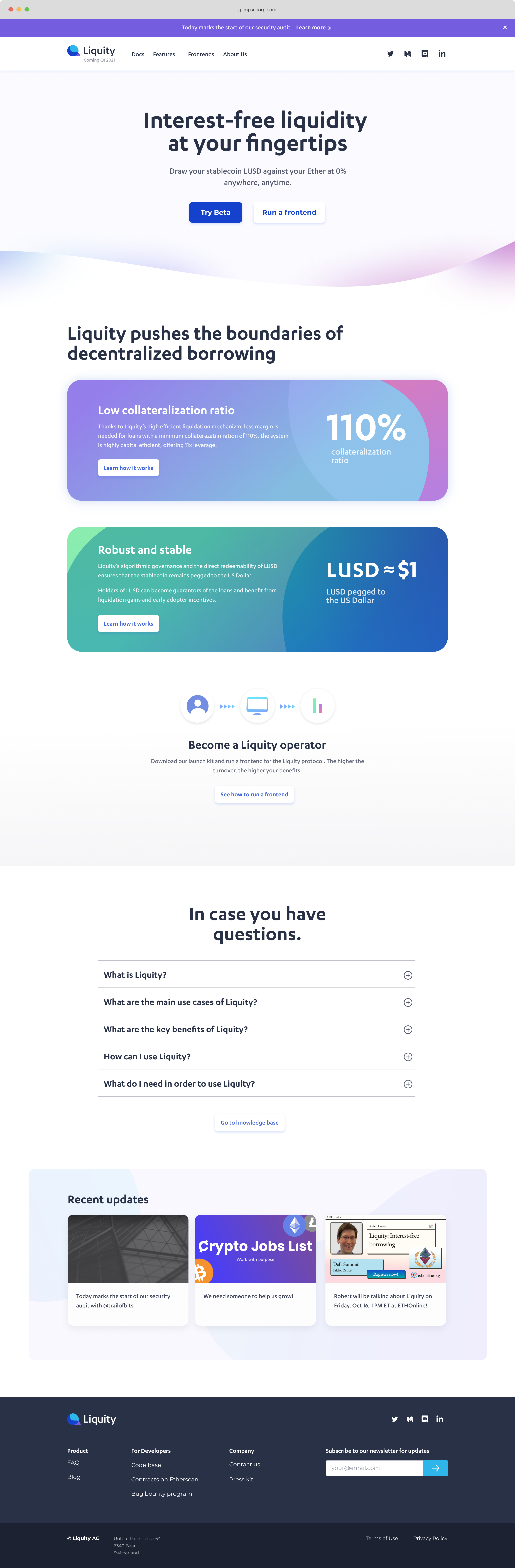
As the protocol moved toward launch, I expanded the site to show how borrowing worked and what Liquity offered.
Outcome
The logo and first Webflow site shipped in a couple of weeks.